










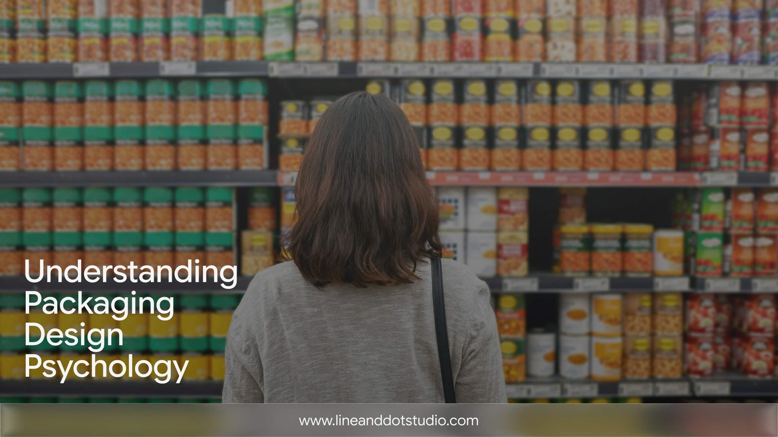
The Psychology of Packaging: What a Product Says Before Anyone Reads the Label
The short version
- Packaging is tasted first. Before a buyer reads a word, their brain forms a verdict from colour, shape, weight, and material — and then transfers that verdict onto the product itself. Mid-century researcher Louis Cheskin called this sensation transference.
- This transfer follows predictable rules. Decades of sensory science show that rounded shapes read as sweeter, angular shapes as sharper; some colours reliably signal specific tastes; and easy-to-process design is judged more beautiful and more trustworthy.
- The most useful finding for anyone choosing packaging is the counterintuitive one: sustainability cues can actually lower perceived quality unless you reassure the buyer — so "eco" is not a free win.
- This is what packaging psychology studies: that first, pre-verbal impression — and how to author it on purpose, rather than treat the pack as decoration added at the end.
In 2001, a team of wine researchers at the University of Bordeaux dyed a white wine red with an odourless colouring and gave it to 54 trained oenology students. Asked to describe it, the students reached for the vocabulary of red wine — "cherry," "tobacco," "blackcurrant." The wine underneath was still white. Their eyes had overruled their noses (Morrot, Brochet & Dubourdieu, 2001, Brain and Language).
That experiment is packaging psychology in miniature. Long before anyone reads an ingredient list or a claim, they have already tasted the packaging — and their experience of the product bends to match it. Packaging psychology is simply the study of how a package shapes what we expect and then experience, and it is why the wrapper is a strategic decision rather than a finishing touch. The label informs. The package persuades, and it does so first.
None of this is folklore. Behind the intuition sits a real, replicable body of sensory science — one that maps, with surprising consistency, what colour, shape, weight, and material actually communicate before a single word is read.
Packaging Is Tasted First: The Idea of Sensation Transference
In the 1940s and '50s, a market researcher named Louis Cheskin noticed something that still governs packaging today: people rarely separate their feelings about a package from their feelings about the product inside. They transfer one onto the other, usually without knowing it. He called it sensation transference.
Cheskin's documented demonstrations are now part of design history. When he made the yellow on a 7-Up can slightly more golden, drinkers reported the soda tasted more lemon-lime — though the recipe never changed. In a blind "luncheon" test, homemakers judged identical spreads differently depending only on whether they were coloured like butter or margarine (accounts reported in Thomas Hine's The Total Package, 1995, and Malcolm Gladwell's Blink, 2005). (The exact figures often quoted for these tests circulate through secondary retellings, so treat them as illustrative rather than precise.)
The practical lesson is bigger than any single trick. It means your packaging is not describing the product — to the buyer's brain, it is part of the product. A cheaper-feeling wrapper does not sit neutrally around good contents; it makes the contents taste, feel, and perform a little cheaper. This is the single most important thing to understand before choosing how a product is packaged.
The Hidden Grammar of Packaging Psychology: What Shape, Colour, and Weight Signal
If packaging is tasted first, the obvious question is: what is it saying? Here the research gets specific — and genuinely useful — because these signals are surprisingly consistent across people and cultures.
Packaging shape and taste: why form has a flavour
Work by Charles Spence and colleagues at Oxford has mapped a reliable link between shape and taste. Across studies, people match rounded forms to sweetness and angular, jagged forms to bitterness, sourness, and carbonation — and the pleasantness of a taste partly explains the shape it gets matched to (Velasco, Woods, Deroy & Spence, 2015, Food Quality and Preference). A later review connected this directly to packaging and logo curvature as a lever on flavour expectation (Velasco et al., 2016, Food Quality and Preference). A softly rounded bottle and a sharp, faceted one are not just two aesthetics — they set two different expectations on the tongue.
Colour psychology: how hue sets taste expectations
The same research tradition finds systematic, cross-culturally recurring links between colours and basic tastes — red and pink lean sweet, green and yellow lean sour (Spence & Levitan, 2021, i-Perception). This is why a colour choice on a package is never only a mood; it is a prediction the buyer's senses will try to confirm. Spence gathers much of this into an accessible book, Gastrophysics (2017), if you want to go deeper.
What packaging materials signal about quality — with a caveat
There is a long-held belief in design that heavier feels more important and premium. The influential study behind it found that incidental touch — a heavier clipboard, a rougher surface — shifted people's judgments toward "more serious," "more difficult," "more rigid" (Ackerman, Nocera & Bargh, 2010, Science). We include it because it shaped a generation of packaging thinking — but honestly: a later high-powered replication failed to reproduce the heaviness effect. So treat weight as a plausible premium cue, not a guaranteed one, and lean on the more robust shape and colour findings when the stakes are high.
The point of this section is not to memorise a lookup table. It is to design deliberately: every curve, hue, and material is making a promise the product then has to keep.
Why Minimalist Packaging Works: Processing Fluency
Designers often feel pressure to fill the available space — another badge, another burst, one more line of copy. The science points the other way.
People consistently judge things they can process easily as more attractive, more trustworthy, and even more true. This is processing fluency, and the drivers are concrete: symmetry, clear figure-ground contrast, and prototypical, expected forms all make a design "click" faster — and that fluency is experienced as pleasure (Reber, Schwarz & Winkielman, 2004, Personality and Social Psychology Review). This matters doubly at the shelf, where eye-tracking shows shoppers rely on a fast, first-glance visual search — and packaging's salient elements are what steer that search and the decision that follows (Clement, 2007, Journal of Marketing Management).
So "minimal" packaging is not a style preference. A cleaner design is easier to read, and easy-to-read is translated by the brain into better. When we advise removing an element rather than adding one, this is the evidence behind it.
Packaging and Brand Identity: Read as a Whole, Not a Checklist
It is tempting to design a package part by part — logo here, colour there, a shape decision, a material decision. But buyers do not assemble those parts. They perceive a single, holistic impression, and that impression maps onto a brand personality.
Researchers who studied packaging holistically identified a small set of design "types" — described as massive, contrasting, natural, delicate, and nondescript — that reliably shifted the brand impressions people formed (Orth & Malkewitz, 2008, Journal of Marketing). A "delicate" system (fine type, generous space, soft palette) and a "massive" one (bold forms, high contrast, heavy blocks) tell different stories about who a brand is — before a single word is read. This is also the deeper framework behind Peter Bloch's seminal 1995 model in the Journal of Marketing, which showed a product's form driving both how people feel and how they act, moderated by their own tastes and the moment they are in.
The practical implication: coherence beats collection. Packaging that is designed as one deliberate whole — and that agrees with the brand's website, logo, and tone — reads as a confident, single voice. This is the strongest argument for having the same team shape both your brand identity and your packaging, so the story does not fracture between vendors.
Not sure your packaging and the rest of your brand are telling the same story?
Sustainable Packaging Perception: When "Eco" Can Backfire
Here is the finding you will rarely see in a packaging listicle, because it complicates the easy narrative.
Sustainable cues can help. Recent work finds that eco-friendly packaging can raise a product's perceived healthiness through a kind of "green halo," which in turn lifts purchase intention (Ruan et al., 2026, Foods). But the same signals can also hurt. In a controlled study, beer and wine presented in sustainable paper bottles were rated lower on sensory quality, overall quality, and acceptable price than the identical drinks in glass — a negative sustainability halo (Techawachirakul, Pathak, Motoki & Calvert, 2023, Psychology & Marketing).
Why the split? Because sensation transference cuts both ways. If a material reads as "flimsy," some of that flimsiness transfers to the product. The same study points to the fix: pair the sustainable choice with clear reassurance cues about quality, so the buyer does not read "eco" as "lesser." For any brand moving to recycled or minimal packaging, that is the difference between a choice that elevates and one that undercuts — and almost nobody designs for it.
How to Use Packaging Psychology: A Practical Checklist
You do not need a psychology degree to apply this. A useful way to brief or review packaging is to ask, for each decision: what will this transfer onto the product?
- Shape: Does the silhouette match the promise? For a precision product, precise geometry; for something soft or indulgent, rounder forms. When we designed packaging for India Pistons (auto components), the brief was to build packaging that looks as precise as the parts inside — the form itself had to transfer engineering confidence. See the project.
- Colour: Is the palette setting the right sensory expectation, not just a mood? For Ray Décore, a decorative-accessories brand, a rich gradient-purple identity carried from packaging to signage to the online store — one coherent signal across every surface. See the project.
- Material and finish: What does the substrate feel like it's worth? If you are choosing a sustainable material, plan the reassurance cue in the same breath.
- Fluency: Can a stranger grasp the most important thing in one glance? If not, remove — don't add.
- Wholeness: Does the package agree with the brand's other touchpoints, or contradict them?
Answer those five honestly and you are already designing better than most.
Frequently Asked Questions
The Takeaway
Good packaging is not about looking expensive. It is about controlling the impression a product makes in the seconds before anyone reads a word — because that impression does not stay on the package. It transfers onto the product, and shapes how the product is experienced. That is the whole of packaging psychology in one sentence.
Colour sets a taste expectation. Shape makes a sensory promise. Weight and finish hint at worth. Fluency signals confidence. And a sustainable choice can lift a brand or undercut it, depending on whether you design the reassurance in. None of it is decoration. All of it is communication — and it is happening whether or not it was intended.
If you are shaping packaging for a new product, or wondering whether your current packaging is transferring the right things, it often helps to look at it with fresh, evidence-led eyes.
See what your packaging is really saying
Tell us what you are building, and we will take an honest, evidence-led look at what your pack transfers onto the product. No pressure either way.
