










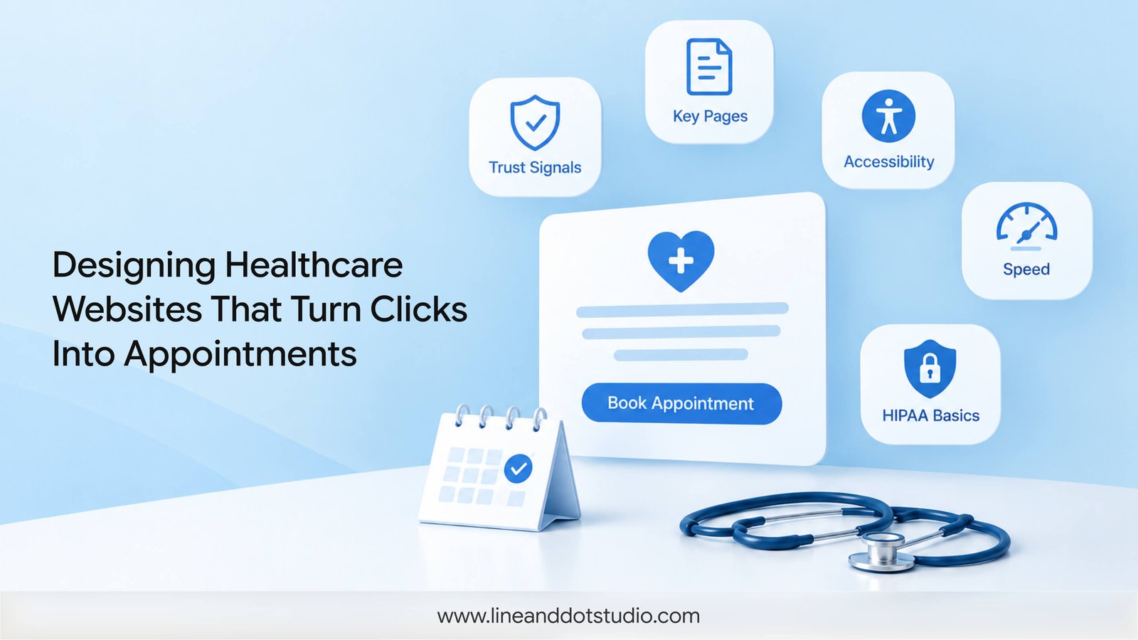
A patient looking for a cardiologist does not read your website. They scan it, in about the time it takes to read this sentence, and decide whether you look like someone they can trust with their heart. Medical website design is the work of winning that decision. Not with louder colors or a bigger logo, but by answering, fast, the two questions every patient arrives with: Can these people help me, and what do I do next?
Most medical sites answer neither. They open with a stock photo of a smiling stranger in a lab coat, bury the phone number, and make booking an appointment feel like filing taxes. This is a guide to building the opposite.
The short version
A medical website has one job: turn a worried, hurried visitor into a booked patient. That takes credibility signals in the first five seconds, pages that answer real patient questions, accessibility that meets the law, a fast mobile booking flow, and privacy that holds up under HIPAA. Design is the difference between a site that sits there and one that fills the schedule.
What Medical Website Design Really Means
Medical website design is not decoration laid over a template. It is the practice of shaping how a patient thinks and feels as they move from "I need help" to "I have an appointment." Every choice, the order of the pages, the size of the type, where the "Book now" button sits, either moves that patient forward or gives them a reason to close the tab and try the next practice on Google.
A marketing tool, not a digital brochure
A brochure describes you. A marketing tool changes what the reader does. The distinction matters because most practices brief their site like a brochure ("put our services, our doctors, our address") and then wonder why it generates no calls. A well-designed medical site is built backward from the action you want, whether that is a booked consultation, a filled contact form, or a phone call, and every page is measured against whether it earns that action.
The three jobs a healthcare website has to do
Strip away the specialty and every medical site is doing three things at once.
Earn trust in the first few seconds. Health is high-stakes and personal. Before a patient reads a word of your credentials, they are judging whether the site itself feels credible, current, and cared for.
Answer the patient's real question. Someone with knee pain is not searching for "orthopedic excellence." They want to know if you treat what they have, whether you take their insurance, and how soon they can be seen.
Make the next step obvious. The best-designed site in the world fails if the patient cannot tell what to do once they are convinced. One clear action, repeated, beats five competing buttons.
What Patients Judge in the First Five Seconds
People form a first impression of a website in about 50 milliseconds, and design carries most of that judgment. In the Stanford Web Credibility research, when people were asked why they trusted or distrusted a site, the largest share of their reasoning came down to visual design, layout, typography, and how professional the page looked, not the accuracy of the content. For a medical practice, that means the patient is grading your competence as a clinician based on your homepage before they have read a single qualification.
The credibility signals that build instant trust
A few things do the heavy lifting: clean, uncluttered layout; current copyright and content (a 2019 blog post says "we stopped paying attention"); visible proof, real credentials, affiliations, and reviews; and a design that looks intentional rather than assembled. None of these are expensive. They are decisions.
Real faces, and why stock photography quietly costs you
Patients can tell the difference between your actual waiting room and a stock library. Generic imagery, the multi-ethnic team laughing at a salad, reads as anonymous, and anonymity is the enemy of trust in healthcare. Photographs of the real space, the real staff, and the real reception desk let a nervous patient rehearse the visit before they arrive. That rehearsal is worth more than any slogan.
The Pages a Medical Website Cannot Skip
The homepage
The homepage is a signpost, not a destination. Its job is to orient the patient in seconds: who you are, what you treat, and the single most important next step. Resist the urge to say everything here. Say enough to send each visitor confidently toward the page they actually need.
Condition and specialty pages
This is where medical sites win or lose search. A patient rarely searches for "medical website"; they search for "pediatric ENT near me" or "website design for a radiology practice's referral base." Dedicated pages for each condition, service, or specialty let you speak to a specific worry and rank for it. The demand is real and often uncontested: search interest exists for website design tied to individual specialties, radiology, cardiology, oncology, dermatology, among others, and most competitors never build those pages. That gap is yours to take.
The provider and About page
For medical content, Google leans hard on expertise, experience, authoritativeness, and trust, the E-E-A-T standard it applies most strictly to "Your Money or Your Life" topics like health. A thin About page hurts you twice: patients do not get the reassurance they came for, and search engines cannot verify you are a real, qualified provider. Named clinicians, real bios, credentials, and photos are not vanity. They are ranking factors and trust factors at once.
Booking and contact
Whatever action you want, it should be reachable from every page, above the fold, in language a scared patient understands. "Book an appointment" beats "Patient portal access." A phone number that is tappable on mobile beats one buried in the footer.
Designing for Trust: Health Is "Your Money or Your Life" Content
Why Google holds medical sites to a higher bar
Search engines know that bad information about health can hurt people, so they scrutinize medical sites more than they do a recipe blog. That scrutiny rewards sites that demonstrate real expertise and punishes ones that fake it. Design supports this: clear authorship, cited sources, secure connections, and a professional presentation all signal that you are a legitimate provider rather than a content farm.
Accessibility is not optional
Roughly one in four US adults lives with a disability. A medical website that a low-vision patient cannot read, or that a screen reader cannot parse, is turning away the exact people most likely to need care, and exposing the practice to legal risk. Healthcare sites are among the most frequent targets of accessibility lawsuits under the Americans with Disabilities Act.
The fixes are largely design decisions: sufficient color contrast (the WCAG guidelines from the W3C set the measurable thresholds), text that resizes without breaking, forms that work with a keyboard, and alt text on meaningful images. Build these in from the start and accessibility costs almost nothing. Retrofit them later and it costs a redesign.
Speed, Mobile, and the Booking Flow
Why load time is a care-access issue
More than half of your patients will arrive on a phone, often on a cellular connection in a parking lot or a waiting room. Google's research found that as page load time climbs from one second to three, the probability of a mobile visitor abandoning the page rises sharply. For a practice, a slow site is not a technical footnote; it is a patient who gave up before they reached your booking form.
Where booking flows lose patients
Every extra field, every unexplained step, every "create an account first" is a place to lose someone who was ready to commit. The best medical booking flows ask only what is needed to hold the slot, work on a thumb, and confirm clearly. When we designed the platform for Aroma, a nutrition and ordering app, the entire design problem was collapsing a complex flow, browse, customize, see the nutritional breakdown, order, into something a hungry person could finish without thinking. A medical booking flow deserves the same discipline.
Planning a new medical site or a redesign that actually books patients?
What Medical Website Design Costs
Typical ranges by scope
Cost tracks scope, not page count. A single-location practice site with a handful of service pages and a booking integration sits at one end; a multi-location group with custom condition libraries, insurance tools, and patient portals sits far higher. The honest answer to "what does it cost" is another question: what is the site supposed to do? A brochure is cheap. A patient-acquisition engine is an investment, and it is priced like one.
What actually moves the price
The big drivers are custom design versus template, the number of unique page types, integrations (scheduling, EHR, payments), content and photography, and accessibility and compliance work. Cutting the last two to save money is the most expensive decision a practice can make, because it is the one that comes back as a lawsuit or a rebuild.
HIPAA and Privacy on Your Site
A medical website often collects protected health information the moment a patient fills in a contact or intake form, and that pulls the site into HIPAA's orbit. The traps are rarely obvious: a standard contact form emailing submissions in plain text, a chat widget storing conversations, or a marketing tracking pixel quietly sending symptom-page visits to an ad network. Each is a compliance problem hiding inside a normal-looking feature. We cover the specifics in our guide to HIPAA-compliant website design, and it is worth reading before you brief a single form.
What This Looks Like When It Works
A website's real test is a business result, not a design award. One of our clients, Bharat Engineering, sells food-processing machinery to industrial buyers, a technical, trust-heavy sale that has a lot in common with healthcare: a specialized audience, high stakes, and a decision that hinges on credibility.
Line and Dot Studio designed the website I needed to pitch a client in Egypt and close the deal. Since then, we have expanded beautifully across the Middle East, Syria, and Turkey.
Vishal, CEO, Bharat Engineering Company
The site did not "look nice." It gave a serious buyer, half a world away, enough clarity and confidence to commit. That is the same job a medical site does for a patient across town. When we built the marketing site and product interface for Manasara AI, an AI building-code compliance tool, the brief was almost identical to a healthcare one: make something technical and regulated feel trustworthy and easy to use for a cautious, expert audience. The principles carry directly.
