










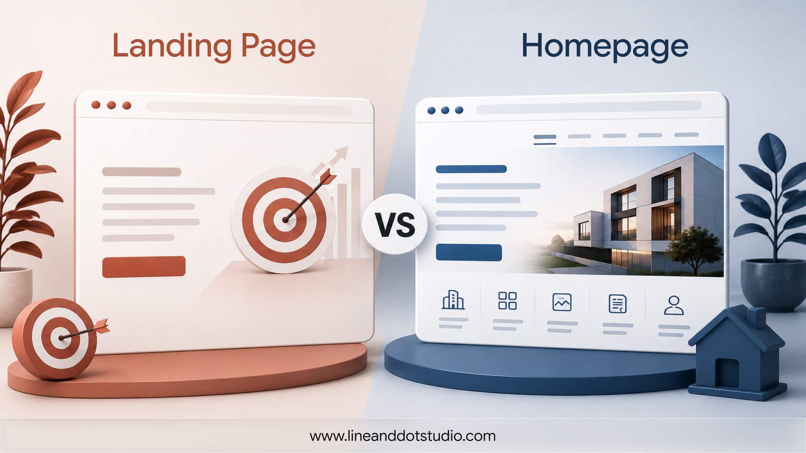
What is the real difference between a landing page and a homepage?
The real difference is purpose: a homepage helps people orient themselves, while a landing page moves one specific person toward one specific action. Your homepage is a lobby. It welcomes every kind of visitor, points to every service, tells your brand story, and offers a dozen paths forward. That is exactly right for someone who found you organically and wants to look around.
A landing page has no lobby. It has one job, one message, and one clear call to action, with the distractions stripped out.
- Homepage: multiple paths, full navigation, brand overview, many audiences at once.
- Landing page: single goal, single CTA, matched to one ad and one audience.
When you send a paid click to a homepage, you hand the visitor a map and ask them to find their own way. When you send it to a dedicated landing page, you have already cleared the route.
Why sending paid traffic to your homepage costs more than you think
Sending paid traffic to your homepage costs more because it forces the visitor to do work you already paid to remove. Someone clicked your ad because a specific promise caught their eye. If they land on a homepage covering five services, that promise disappears into a wall of options, and their attention pays the price.
Three forces are quietly working against you here, and each one is well documented.
The first is message match. Your ad plants an expectation in the visitor's head, something like "custom packaging design." The design researcher Don Norman calls this a person's mental model, the story they are already telling themselves about what happens next. When the page they land on says "Welcome to our studio," it quietly contradicts that story, and the visitor feels the gap before they can even name it. Norman calls the distance between what someone expects and what the screen actually gives them the gulf of evaluation. A matched headline closes that gulf in an instant. A mismatched one leaves the visitor stranded on the wrong side of it.
The second is cognitive load, and there is a famous study about exactly this. At Columbia University, the psychologists Sheena Iyengar and Mark Lepper set up a tasting table with jams. When they offered 24 varieties, plenty of people stopped to look, but almost nobody bought. When they cut the choice to 6, sales were about ten times higher. More options did not help people decide, they froze them. A homepage listing five services is the 24-jam table. It also asks more of working memory than most visitors will spend: research by Nelson Cowan puts the number of things we can actively hold in mind at around four. Add the plain fact that people follow the path of least effort, and a busy homepage is asking a stranger to work harder than they want to for a business they only just met. A landing page makes the choice for them.
The third is the scent trail. The researchers Peter Pirolli and Stuart Card, working at Xerox PARC, described how people forage for information online much as animals forage for food, following a scent of relevance from one click to the next. A page that matches the ad keeps that scent strong and draws the visitor forward. A mismatched page kills it, and they back out to the search results to pick up the trail somewhere else.
The part almost nobody mentions: a mismatched page quietly costs you trust
There is a cost beyond a single lost click, and it lands faster than you would think. People form a first visual impression of a page in about 50 milliseconds, according to research by Gitte Lindgaard and colleagues. That snap judgement has nothing to do with your copy, which they have not read yet. It is about whether the page looks and feels like the right place to be. Stanford's long-running Web Credibility research, led by B.J. Fogg, found that people judge how much to trust a business largely on the look and feel of its site, before they weigh anything you actually say. So a cluttered, off-message homepage does not only make the visitor work harder. In the first half a second, it makes them trust you less. The downstream numbers reflect all of this: the average landing page converts at around 9.7% against roughly 2.35% for general website pages, a gap that industry benchmarks from Backlinko report across large sample sets.
The decision matrix: landing page vs homepage for your next ad
Here is a rule you can apply in thirty seconds. If the ad promises something specific, build a specific page for it. If the ad is broad or brand-led, your homepage can carry it. This is the practical core of the homepage vs landing page conversion rate question.
| Scenario | Use this |
|---|---|
| Google or Meta ad for a specific service | Dedicated landing page |
| Branded search ad (your company name) | Homepage works; a focused version is better |
| Promoting a single offer, event, or lead magnet | Dedicated landing page |
| General brand-awareness display campaign | Homepage acceptable |
| Retargeting visitors who saw a specific service | Dedicated landing page |
The payoff for getting this right is measurable. In one branded paid search A/B test, a dedicated landing page reached nearly three times the conversion rate of a homepage, at roughly a third less cost per conversion. Same ad, same audience, same budget. The only variable that changed was where the click landed.
What a well-built landing page actually contains
A landing page that converts does five things, and it does them without clutter. Each one exists to keep the visitor's attention on the single action you want them to take.
- A headline that mirrors the ad copy, so message match is instant and the promise carries through.
- One clear, specific CTA. Here is the counterintuitive part: adding a second and third call to action does not give people more ways to convert, it gives them a reason to convert on none of them. In the well-known invisible gorilla experiment by the psychologists Daniel Simons and Christopher Chabris, people concentrating on one task missed something as obvious as a person in a gorilla suit strolling through the scene. Attention is that narrow. Two competing buttons fight over the same thin beam of it. So make it one action, and make that button obvious: in Norman's language, it should signal plainly what it does rather than make people guess. "Book a Free Design Audit" beats a vague "find out more."
- A vertical-specific proof point: a case study thumbnail, a signed client quote, or a real result the visitor recognizes.
- Minimal navigation. No top menu inviting people to wander off to your blog or careers page.
- A mobile-first layout, because most landing-page conversions now happen on mobile.
You do not need a landing page to see this principle in action. When Line & Dot built a website for Bharat Engineering Company, the work put their food-processing machinery front and center with clear product pages and friction-free navigation for industrial buyers. Vishal, the CEO, put it plainly: "Line and Dot Studio designed the website I needed to pitch a client in Egypt and close the deal. Since then, we have expanded beautifully across the Middle East, Syria, and Turkey." The same logic applies to a landing page: clarity of purpose, matched to what the visitor came for, does the converting.
The 55% lead lift: why more landing pages mean more leads
Businesses with 10 to 15 landing pages tend to generate around 55% more leads than those running fewer than ten, according to industry benchmarks. The reason is straightforward. Each page targets one audience segment, one offer, and one ad set, so the message stays tight every time.
One homepage cannot do that. If you offer branding, UI/UX, packaging, and interior design, a single page has to speak to four different buyers at once, and it ends up speaking to none of them clearly. A dedicated page for each service line lets you write to one person about one problem.
This matters most for multi-service businesses. Every service you run is a candidate for a focused page, a matched ad, and a cleaner path to a lead. Good web design and sharp brand design are built on exactly that kind of single-purpose clarity. More focused pages give your ads more precise places to land.
Conclusion
Think of your ad as a promise and your landing page as the place you keep it. When the two agree, attention flows straight from the click to the action, and every pound or dollar of spend works harder. When they disagree, that attention leaks away before you ever get a chance to earn it.
Don Norman's rule for everyday objects holds up online too: when people fail to do the thing you were hoping for, it is almost always the design at fault, not the person. So when your ads are not converting, the visitor is rarely the problem. The place you sent them usually is. The fix is rarely a bigger budget. It is usually a better place to land. Get the page right, and the ads you are already running start pulling their weight.
If you are running ads and want a second pair of eyes on where your clicks are landing, the team at Line & Dot is happy to take a look. Start a conversation with us and we will tell you honestly what we see.
