










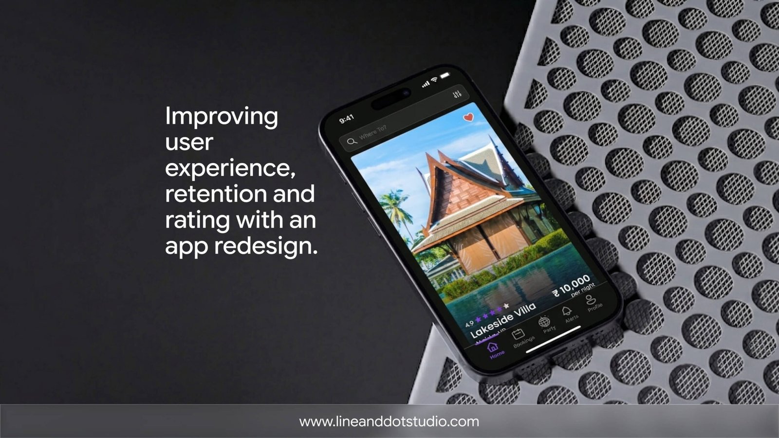
An app redesign in 2026 usually costs between $8,000 and $150,000+, takes 4 to 12 weeks for a focused product and longer for a multi-platform rebuild, and, done right, pays for itself through higher retention, smoother onboarding, and better reviews. Done wrong, it ships a prettier version of the same problems and changes none of the numbers that matter.
This guide covers what a redesign actually involves, the signs you genuinely need one, the step-by-step UX process, honest cost tiers, the return to expect, and how to choose a redesign partner. It is written for founders and product leads weighing both the work and the agency.
What an app redesign actually means
"Redesign" gets used for two very different jobs, and confusing them is the first place budgets go wrong:
- A UI refresh changes the visual layer: type, colour, spacing, components, iconography. The flows stay the same; the app just looks current. Faster and cheaper.
- A UX redesign changes how the app works: navigation, information architecture, onboarding, the core task flows, and the friction inside them. This is where retention and conversion actually move.
Most real redesigns are some blend of the two, plus a refreshed design system so the next feature does not reintroduce the mess you just cleaned up. A SaaS product redesign adds a third layer: aligning the interface with a product that has outgrown its original structure. The spread in price comes almost entirely from how far down that list you need to go. The trigger is often outside your control, too: when a platform overhauls its own visual language, the way Apple did with its Liquid Glass redesign in iOS 26, an app that looked current last year can suddenly feel a generation behind.
Signs your app actually needs a redesign
Not every drop in numbers calls for a teardown. These are the patterns that usually do:
- Growth outpaced the design. The app shipped fast, found product-market fit, and the original structure is now buckling under features it was never built for.
- Onboarding leaks. People sign up and never reach the moment the product becomes useful. They churn before they understand the value.
- A credibility gap. The functionality is strong, but a dated interface makes prospects assume the product is dated too. First impressions are overwhelmingly visual, and they form in seconds.
- Unexplained churn. Attrition that is not a pricing or market problem usually traces back to friction in the core flows.
- Feature bloat. Every new feature has added a tab, a menu, a setting, until the thing that made the app simple is buried.
- Poor and worsening reviews. App-store ratings are a public, compounding signal; a redesign that fixes navigation can move a rating meaningfully (one published redesign lifted an app from 4.3 to 4.8 stars).
If two or more of these are true, you are looking at a redesign, not a patch. If none of them are and you are still proving the core idea works, the job is not a redesign at all; it is closer to building and validating a lean first version, which carries a different scope and a different budget.
Spotted your app in two or more of those? A quick audit will tell you what is worth fixing first.
Evolutionary or revolutionary: which redesign do you need?
This is the decision most guides skip, and it sets your budget, timeline, and risk:
- Evolutionary (a refresh) keeps the structure your users already know and improves it in place: cleaner visuals, a tightened design system, a few reworked screens. Lower risk, lower cost, and you do not retrain your existing users.
- Revolutionary (a rebuild) rethinks the flows, the architecture, sometimes the platform. Higher upside when the current structure is genuinely broken, but higher risk: a dramatic change can frustrate loyal users if the gains are not obvious.
The rule of thumb: choose evolutionary when the positioning and core model still hold and you mostly need clarity and polish. Choose revolutionary when the app describes a product you no longer are, or the structure cannot carry where the roadmap is going. A slow month is not a reason to rebuild; "our users cannot find the thing they came for" is.
How to redesign an app UX: the 7-step process
The teams that get a return run a process, not a mood board. This is the sequence that holds across well-run redesigns:
- Define the goal and the metric. Pick one primary outcome the redesign has to move: activation rate, day-30 retention, task completion, or review score. "Make it modern" is not a goal; "lift onboarding completion from 38% to 55%" is.
- Audit the current experience. Run a UX audit on the real product: review the core flows, map the user journey, and find where people stall. Pair behavioural data (funnels, drop-off, session replays, rage taps) with the qualitative why from user interviews. This is where the actual problems surface, not the ones you assumed.
- Study users and competitors. Confirm what your users are trying to do and how directly competitors let them do it. The point is not to copy; it is to know the convention your users already expect before you decide where to break it.
- Set the strategy and prioritise. Turn audit findings into a ranked list of changes by impact and effort. Decide evolutionary versus revolutionary here, and define the new information architecture before anyone opens a design tool.
- Wireframe, then prototype. Lay out the structure in low fidelity first, get the flows right, then move to high-fidelity, clickable prototypes and a reusable design system, not a pile of one-off screens.
- Test with real users. Usability testing catches the problems your team is too close to see. You do not need a big panel; a handful of target users will surface the majority of serious usability issues, which is exactly why testing early is cheaper than testing after launch (Nielsen Norman Group).
- Launch in stages, then monitor. Roll out in phases where you can (beta group, feature flag, staged release) rather than flipping everything at once, then watch the metric you set in step one and keep refining. Launch is the start of the work, not the finish.
The two steps teams cut to "save time," the audit and post-launch testing, are the exact two that decide whether the redesign returns anything.
What an app redesign costs in 2026
Pricing tracks with how much of the process you need and who does it. The honest 2026 landscape:
| Tier | Typical range (2026) | What it covers | Best for |
|---|---|---|---|
| UI refresh / visual uplift | $8,000 – $20,000 | New visual layer on existing flows, design-system tidy-up, updated components | An app whose structure works but looks dated |
| Full UX + UI redesign | $20,000 – $70,000 | Research, UX audit, restructured flows, new design system, prototypes, usability testing | Apps with onboarding, retention, or clarity problems |
| Product / multi-platform redesign | $70,000 – $150,000+ | Deep research, iOS, Android and web, complex flows, design plus build support, post-launch testing | SaaS products and scaled apps |
A few notes on the numbers. Single-screen, templated freelance work can land as low as $3,500–$10,000, and some guides quote that as the price of a redesign; treat it as the floor for a cosmetic touch-up, not an agency-grade product redesign. Designer rates themselves run roughly $30 to $250 an hour depending on seniority and region, which is most of why the same brief can produce wildly different quotes. The biggest cost driver, though, is rarely the design itself; it is how clearly the problem is defined before the work starts.
A note on studio economics.
US, UK, UAE, and EU teams increasingly pair senior design craft with India-based delivery, which compresses the cost of the "full redesign" and "product redesign" tiers without dropping quality. That is the model Line & Dot Studio runs.
Skip the guesswork. Send your app and get a real number, not a range.
The return: what a good redesign gives back
A redesign earns its keep in numbers, not screenshots. The returns show up in four places:
- Activation and onboarding. Cutting friction out of the first session is the single highest-leverage change; studios regularly report large activation lifts after reworking onboarding alone.
- Retention and churn. Friction in the core flows is a quiet churn driver. Published SaaS redesigns have cut churn dramatically and lifted retention by double digits once the broken flows were fixed.
- Feature adoption. Making the right feature findable moves usage. One redesign of an in-app search experience lifted feature adoption by 20% after session-replay analysis showed only a fifth of users were finding it (UXCam).
- Reviews and trust. Ratings compound. A cleaner, faster app pulls up store ratings, and a higher rating pulls in more installs, which is a flywheel a refresh can start.
The discipline that separates a paying redesign from a vanity one is simple: model the lift before you spend. If you cannot connect the work to activation, retention, or a review score, you are buying decoration.
Common mistakes that quietly waste the budget
The failure patterns are consistent across redesigns that flop:
- No research. Redesigning on opinion instead of data, then "fixing" problems users never had.
- No clear objective. Without a target metric, you cannot tell whether the redesign worked, so it never gets defended internally.
- Skipping usability testing. Shipping straight from Figma to the store and discovering the new flow confuses people in the reviews.
- Changing everything at once. A total overhaul with no staged rollout disorients loyal users and makes it impossible to tell which change moved which number.
- Going quiet on users. Not explaining what changed and why, so even good changes read as disruption.
Avoid all five. Let's map your redesign around a metric, not a mood board.
SaaS product redesign: what is different
A SaaS product redesign carries extra weight because the interface is the product, and design increasingly does the selling. Three things change the brief:
- Onboarding and activation are the redesign. For product-led growth, the first session has to deliver value without a sales call. That is where most of the budget should go.
- Complexity has to be tamed, not hidden. Mature SaaS tools accumulate features; the job is restructuring information architecture so power stays accessible while the default path stays simple. It is the difference between a calm, structured interface and a cluttered one, which is the line we walked designing a building-compliance SaaS platform that had to make a technically dense tool feel intuitive.
- The design system is a deliverable, not a byproduct. A SaaS product ships forever. A documented, developer-ready system is what stops the next quarter of features from undoing the redesign.
This is the work behind SaaS product redesign services: not a new coat of paint, but a structural fix tied to activation and retention.
How to choose an app redesign agency
The agency you pick matters as much as the budget. Before you sign, ask:
- Show me comparable app work, by the designer who will be on my project, not just the studio reel.
- What does your audit and research process look like? No discovery means no strategy, which means redesign roulette.
- How do you think about outcomes? A team that answers only in deliverables is in the output business. One that asks about your activation and retention goals is in the outcomes business. Pick the second.
- Will I get a documented design system and developer-ready handoff? This is what makes the redesign last.
- What happens after launch? A testing and iteration plan is what turns a one-off project into a compounding asset.
A clear brief on your side speeds everything up: one primary metric to move, your current analytics, your core user flows, and any brand guidelines. The most common source of delay in a redesign is not design or code; it is slow internal decisions. Sort that before kickoff.
Working with Line & Dot Studio
We treat an app redesign as a product problem, not a paint job: audit and research first, a reusable design system second, and a measurable outcome running through all of it. Our team handles UI/UX and product design, website design, and brand design under one roof, so the experience, the visuals, and the build stay in step. We work with teams across the US, UK, UAE, and Europe, with delivery economics that keep the work cost-effective. See how that played out on a SaaS product we designed end to end, browse the rest of our work, or tell us the metric you need to move.
Quick checklist before you brief an agency
- Define the one metric the redesign must move (activation, retention, task completion, or rating).
- Pull your current analytics so you know the baseline.
- Decide evolutionary or revolutionary before you brief.
- Map your core user flows and where people stall.
- Ask for comparable app work by your actual designer.
- Confirm you will get a documented design system and a post-launch plan.
Frequently Asked Questions About App Redesign
Planning a redesign? Let's tie it to a metric.
Tell us the number you need to move and we will scope the work against it.
